Layers
A style's layers property lists all the layers available in that style. The type of layer is specified by the "type" property, and must be one of background, fill, line, symbol, raster, circle, fill-extrusion, heatmap, hillshade.
Except for layers of the background type, each layer needs to refer to a source. Layers take the data that they get from a source, optionally filter features, and then define how those features are styled.
"layers": [
  {
    "id": "coastline",
    "source": "trackasia",
    "source-layer": "contries",
    "type": "line",
    "paint": {
      "line-color": "#198EC8"
    }
  }
]
Layer properties
filter
Optional expression.
A expression specifying conditions on source features. Only features that match the filter are displayed. Zoom expressions in filters are only evaluated at integer zoom levels. The feature-state expression is not supported in filter expressions.
id
Required string.
Unique layer name.
layout
Optional layout.
Layout properties for the layer.
maxzoom
Optional number.
The maximum zoom level for the layer. At zoom levels equal to or greater than the maxzoom, the layer will be hidden.
metadata
Optional.
Arbitrary properties useful to track with the layer, but do not influence rendering. Properties should be prefixed to avoid collisions, like 'trackasia:'.
"metadata": {
  "source:comment": "Hydrology FCCODE 460 - Narrow wash"
}
minzoom
Optional number.
The minimum zoom level for the layer. At zoom levels less than the minzoom, the layer will be hidden. paint Optional paint.
Default paint properties for this layer.
source
Optional string.
Name of a source description to be used for this layer. Required for all layer types except background.
source-layer
Optional string.
Layer to use from a vector tile source. Required for vector tile sources; prohibited for all other source types, including GeoJSON sources.
type
Required enum. One of "fill", "line", "symbol", "circle", "heatmap", "fill-extrusion", "raster", "hillshade", "background".
Rendering type of this layer.
- "fill":
- A filled polygon with an optional stroked border.
- "line":
- A stroked line.
- "symbol":
- An icon or a text label.
- "circle":
- A filled circle.
- "heatmap":
- A heatmap.
- "fill-extrusion
- An extruded (3D) polygon.
- "raster":
- Raster map textures such as satellite imagery.
- "hillshade":
- Client-side hillshading visualization based on DEM data. Currently, the implementation only supports Mapbox Terrain RGB and Mapzen Terrarium tiles.
- "background":
- The background color or pattern of the map.
Sub properties
Layers have two sub-properties that determine how data from that layer is rendered: layout and paint properties, explained below.
layout property
Layout properties appear in the layer's "layout" object. They are applied early in the rendering process and define how data for that layer is passed to the GPU. Changes to a layout property require an asynchronous "layout" step.
paint property
Paint properties are applied later in the rendering process. Paint properties appear in the layer's "paint" object. Changes to a paint property are cheap and happen synchronously.
background
The background style layer covers the entire map. Use a background style layer to configure a color or pattern to show below all other map content. If the background layer is transparent or omitted from the style, any part of the map view that does not show another style layer is transparent.
background-color
Paint property. Optional color. Defaults to "#000000". Disabled by background-pattern. Supports interpolate expressions. Transitionable.
The color with which the background will be drawn.
background-opacity
Paint property. Optional number. Defaults to 1. Supports interpolate expressions. Transitionable.
The opacity at which the background will be drawn.
background-pattern
Paint property. Optional resolvedImage. Transitionable.
Name of image in sprite to use for drawing an image background. For seamless patterns, image width and height must be a factor of two (2, 4, 8, ..., 512). Note that zoom-dependent expressions will be evaluated only at integer zoom levels.
visibility
Layout property. Optional enum. One of "visible", "none". Defaults to "visible".
Whether this layer is displayed.
- "visible":
- The layer is shown.
- "none":
- The layer is not shown.
fill
A fill style layer renders one or more filled (and optionally stroked) polygons on a map. You can use a fill layer to configure the visual appearance of polygon or multipolygon features.
fill-extrusion-base
Paint property. Optional number. Units in metersUnits in Defaults to 0. Requires fill-extrusion-height. Supports feature-state and interpolate expressions. Transitionable.
The height with which to extrude the base of this layer. Must be less than or equal to fill-extrusion-height.
fill-extrusion-color
Paint property. Optional color. Defaults to "#000000". Disabled by fill-extrusion-pattern. Supports feature-state and interpolate expressions. Transitionable.
The base color of the extruded fill. The extrusion's surfaces will be shaded differently based on this color in combination with the root light settings. If this color is specified as rgba with an alpha component, the alpha component will be ignored; use fill-extrusion-opacity to set layer opacity.
fill-extrusion-height
Paint property. Optional number. Units in metersUnits in Defaults to 0. Supports feature-state and interpolate expressions. Transitionable.
The height with which to extrude this layer.
fill-extrusion-opacity
Paint property. Optional number. Defaults to 1. Supports interpolate expressions. Transitionable.
The opacity of the entire fill extrusion layer. This is rendered on a per-layer, not per-feature, basis, and data-driven styling is not available.
fill-extrusion-pattern
Paint property. Optional resolvedImage. Transitionable.
Name of image in sprite to use for drawing images on extruded fills. For seamless patterns, image width and height must be a factor of two (2, 4, 8, ..., 512). Note that zoom-dependent expressions will be evaluated only at integer zoom levels.
fill-extrusion-translate
Paint property. Optional array of numbers. Units in pixelsUnits in Defaults to [0,0]. Supports interpolate expressions. Transitionable.
The geometry's offset. Values are [x, y] where negatives indicate left and up (on the flat plane), respectively.
fill-extrusion-translate-anchor
Paint property. Optional enum. One of "map", "viewport". Defaults to "map". Requires fill-extrusion-translate.
Controls the frame of reference for fill-extrusion-translate.
- "map":
- The fill extrusion is translated relative to the map.
- "viewport":
- The fill extrusion is translated relative to the viewport.
fill-extrusion-vertical-gradient
Paint property. Optional boolean. Defaults to true.
Whether to apply a vertical gradient to the sides of a fill-extrusion layer. If true, sides will be shaded slightly darker farther down.
visibility
Layout property. Optional enum. One of "visible", "none". Defaults to "visible".
Whether this layer is displayed.
- "visible":
- The layer is shown.
- "none":
- The layer is not shown.
line
A line style layer renders one or more stroked polylines on the map. You can use a line layer to configure the visual appearance of polyline or multipolyline features.
line-blur
Paint property. Optional number. Units in pixelsUnits in Defaults to 0. Supports feature-state and interpolate expressions. Transitionable.
Blur applied to the line, in pixels.
line-cap
Layout property. Optional enum. One of "butt", "round", "square". Defaults to "butt".
The display of line endings.
-"butt": - A cap with a squared-off end which is drawn to the exact endpoint of the line. -"round": - A cap with a rounded end which is drawn beyond the endpoint of the line at a radius of one-half of the line's width and centered on the endpoint of the line. -"square": - A cap with a squared-off end which is drawn beyond the endpoint of the line at a distance of one-half of the line's width.
line-color
Paint property. Optional color. Defaults to "#000000". Disabled by line-pattern. Supports feature-state and interpolate expressions. Transitionable.
The color with which the line will be drawn.
line-dasharray
Paint property. Optional array of numbers. Units in line widthsUnits in Disabled by line-pattern. Transitionable.
Specifies the lengths of the alternating dashes and gaps that form the dash pattern. The lengths are later scaled by the line width. To convert a dash length to pixels, multiply the length by the current line width. Note that GeoJSON sources with lineMetrics: true specified won't render dashed lines to the expected scale. Also note that zoom-dependent expressions will be evaluated only at integer zoom levels.
line-gap-width
Paint property. Optional number. Units in pixelsUnits in Defaults to 0. Supports feature-state and interpolate expressions. Transitionable.
Draws a line casing outside of a line's actual path. Value indicates the width of the inner gap.
line-gradient
Paint property. Optional color. Disabled by line-dasharray. Disabled by line-pattern. Requires source to be "geojson". Supports interpolate expressions.
Defines a gradient with which to color a line feature. Can only be used with GeoJSON sources that specify "lineMetrics": true.
line-join
Layout property. Optional enum. One of "bevel", "round", "miter". Defaults to "miter".
The display of lines when joining.
- "bevel":
- A join with a squared-off end which is drawn beyond the endpoint of the line at a distance of one-half of the line's width.
- "round":
- A join with a rounded end which is drawn beyond the endpoint of the line at a radius of one-half of the line's width and centered on the endpoint of the line.
- "miter":
- A join with a sharp, angled corner which is drawn with the outer sides beyond the endpoint of the path until they meet.
line-miter-limit
Layout property. Optional number. Defaults to 2. Requires line-join to be "miter". Supports interpolate expressions.
Used to automatically convert miter joins to bevel joins for sharp angles.
line-offset
Paint property. Optional number. Units in pixelsUnits in Defaults to 0. Supports feature-state and interpolate expressions. Transitionable.
The line's offset. For linear features, a positive value offsets the line to the right, relative to the direction of the line, and a negative value to the left. For polygon features, a positive value results in an inset, and a negative value results in an outset.
line-opacity
Paint property. Optional number. Defaults to 1. Supports feature-state and interpolate expressions. Transitionable.
The opacity at which the line will be drawn.
line-pattern
Paint property. Optional resolvedImage. Transitionable.
Name of image in sprite to use for drawing image lines. For seamless patterns, image width must be a factor of two (2, 4, 8, ..., 512). Note that zoom-dependent expressions will be evaluated only at integer zoom levels.
line-round-limit
Layout property. Optional number. Defaults to 1.05. Requires line-join to be "round". Supports interpolate expressions.
Used to automatically convert round joins to miter joins for shallow angles.
line-sort-key
Layout property. Optional number.
Sorts features in ascending order based on this value. Features with a higher sort key will appear above features with a lower sort key.
line-translate
Paint property. Optional array of numbers. Units in pixelsUnits in Defaults to [0,0]. Supports interpolate expressions. Transitionable.
The geometry's offset. Values are [x, y] where negatives indicate left and up, respectively.
line-translate-anchor
Paint property. Optional enum. One of "map", "viewport". Defaults to "map". Requires line-translate.
Controls the frame of reference for line-translate.
- "map":
- The line is translated relative to the map.
- "viewport":
- The line is translated relative to the viewport.
line-width
Paint property. Optional number. Units in pixelsUnits in Defaults to 1. Supports feature-state and interpolate expressions. Transitionable.
Stroke thickness.
visibility
Layout property. Optional enum. One of "visible", "none". Defaults to "visible".
Whether this layer is displayed.
- "visible":
- The layer is shown.
- "none":
- The layer is not shown.
symbol
A symbol style layer renders icon and text labels at points or along lines on a map. You can use a symbol layer to configure the visual appearance of labels for features in vector tiles.
icon-allow-overlap
Layout property. Optional boolean. Defaults to false. Requires icon-image. Disabled by icon-overlap.
If true, the icon will be visible even if it collides with other previously drawn symbols.
icon-anchor
Layout property. Optional enum. One of "center", "left", "right", "top", "bottom", "top-left", "top-right", "bottom-left", "bottom-right". Defaults to "center". Requires icon-image.
Part of the icon placed closest to the anchor.
- "center":
- The center of the icon is placed closest to the anchor.
- "left":
- The left side of the icon is placed closest to the anchor.
- "right":
- The right side of the icon is placed closest to the anchor.
- "top":
- The top of the icon is placed closest to the anchor.
- "bottom":
- The bottom of the icon is placed closest to the anchor.
- "top-left":
- The top left corner of the icon is placed closest to the anchor.
- "top-right":
- The top right corner of the icon is placed closest to the anchor.
- "bottom-left":
- The bottom left corner of the icon is placed closest to the anchor.
- "bottom-right":
- The bottom right corner of the icon is placed closest to the anchor.
icon-color
Paint property. Optional color. Defaults to "#000000". Requires icon-image. Supports feature-state and interpolate expressions. Transitionable.
The color of the icon. This can only be used with sdf icons.
icon-halo-blur
Paint property. Optional number. Units in pixelsUnits in Defaults to 0. Requires icon-image. Supports feature-state and interpolate expressions. Transitionable.
Fade out the halo towards the outside.
icon-halo-color
Paint property. Optional color. Defaults to "rgba(0, 0, 0, 0)". Requires icon-image. Supports feature-state and interpolate expressions. Transitionable.
The color of the icon's halo. Icon halos can only be used with SDF icons.
icon-halo-width
Paint property. Optional number. Units in pixelsUnits in Defaults to 0. Requires icon-image. Supports feature-state and interpolate expressions. Transitionable.
Distance of halo to the icon outline.
icon-ignore-placement
Layout property. Optional boolean. Defaults to false. Requires icon-image.
If true, other symbols can be visible even if they collide with the icon. icon-imageLayout property. Optional resolvedImage.
Name of image in sprite to use for drawing an image background.
icon-keep-upright
Layout property. Optional boolean. Defaults to false. Requires icon-image. Requires icon-rotation-alignment to be "map". Requires symbol-placement to be "line", or "line-center".
If true, the icon may be flipped to prevent it from being rendered upside-down.
icon-offset
Layout property. Optional array of numbers. Defaults to [0,0]. Requires icon-image. Supports interpolate expressions.
Offset distance of icon from its anchor. Positive values indicate right and down, while negative values indicate left and up. Each component is multiplied by the value of icon-size to obtain the final offset in pixels. When combined with icon-rotate the offset will be as if the rotated direction was up.
icon-opacity
Paint property. Optional number. Defaults to 1. Requires icon-image. Supports feature-state and interpolate expressions. Transitionable.
The opacity at which the icon will be drawn.
icon-optional
Layout property. Optional boolean. Defaults to false. Requires icon-image. Requires text-field.
If true, text will display without their corresponding icons when the icon collides with other symbols and the text does not.
icon-overlap
Layout property. Optional enum. One of "never", "always", "cooperative". Requires icon-image.
Allows for control over whether to show an icon when it overlaps other symbols on the map. If icon-overlap is not set, icon-allow-overlap is used instead.
- "never":
- The icon will be hidden if it collides with any other previously drawn symbol.
- "always":
- The icon will be visible even if it collides with any other previously drawn symbol.
- "cooperative":
- If the icon collides with another previously drawn symbol, the overlap mode for that symbol is checked. If the previous symbol was placed using never overlap mode, the new icon is hidden. If the previous symbol was placed using always or cooperative overlap mode, the new icon is visible.
icon-padding
Layout property. Optional padding. Units in pixels.Units in Defaults to [2]. Requires icon-image. Supports interpolate expressions.
Size of additional area round the icon bounding box used for detecting symbol collisions. Values are declared using CSS margin shorthand syntax: a single value applies to all four sides; two values apply to [top/bottom, left/right]; three values apply to [top, left/right, bottom]; four values apply to [top, right, bottom, left]. For backwards compatibility, a single bare number is accepted, and treated the same as a one-element array - padding applied to all sides.
icon-pitch-alignment
Layout property. Optional enum. One of "map", "viewport", "auto". Defaults to "auto". Requires icon-image.
Orientation of icon when map is pitched.
- "map":
- The icon is aligned to the plane of the map.
- "viewport":
- The icon is aligned to the plane of the viewport.
- "auto":
- Automatically matches the value of icon-rotation-alignment.
icon-rotate
Layout property. Optional number. Units in degrees.Units in Defaults to 0. Requires icon-image. Supports interpolate expressions.
Rotates the icon clockwise.
icon-rotation-alignment
Layout property. Optional enum. One of "map", "viewport", "auto". Defaults to "auto". Requires icon-image.
In combination with symbol-placement, determines the rotation behavior of icons.
- "map":
- When symbol-placement is set to point, aligns icons east-west. When symbol-placement is set to line or line-center, aligns icon x-axes with the line.
- "viewport":
- Produces icons whose x-axes are aligned with the x-axis of the viewport, regardless of the value of symbol-placement.
- "auto":
- When symbol-placement is set to point, this is equivalent to viewport. When symbol-placement is set to line or line-center, this is equivalent to map.
icon-size
Layout property. Optional number. Units in factor of the original icon size.Units in Defaults to 1. Requires icon-image. Supports interpolate expressions.
Scales the original size of the icon by the provided factor. The new pixel size of the image will be the original pixel size multiplied by icon-size. 1 is the original size; 3 triples the size of the image.
icon-text-fit
Layout property. Optional enum. One of "none", "width", "height", "both". Defaults to "none". Requires icon-image. Requires text-field.
Scales the icon to fit around the associated text.
- "none":
- The icon is displayed at its intrinsic aspect ratio.
- "width":
- The icon is scaled in the x-dimension to fit the width of the text.
- "height":
- The icon is scaled in the y-dimension to fit the height of the text.
- "both":
- The icon is scaled in both x- and y-dimensions.
icon-text-fit-padding
Layout property. Optional array of numbers. Units in pixels.Units in Defaults to [0,0,0,0]. Requires icon-image. Requires text-field. Requires icon-text-fit to be "both", or "width", or "height". Supports interpolate expressions.
Size of the additional area added to dimensions determined by icon-text-fit, in clockwise order: top, right, bottom, left.
icon-translate
Paint property. Optional array of numbers. Units in pixelsUnits in Defaults to [0,0]. Requires icon-image. Supports interpolate expressions. Transitionable.
Distance that the icon's anchor is moved from its original placement. Positive values indicate right and down, while negative values indicate left and up.
icon-translate-anchor
Paint property. Optional enum. One of "map", "viewport". Defaults to "map". Requires icon-image. Requires icon-translate.
Controls the frame of reference for icon-translate.
- "map":
- Icons are translated relative to the map.
- "viewport":
- Icons are translated relative to the viewport.
symbol-avoid-edges
Layout property. Optional boolean. Defaults to false.
If true, the symbols will not cross tile edges to avoid mutual collisions. Recommended in layers that don't have enough padding in the vector tile to prevent collisions, or if it is a point symbol layer placed after a line symbol layer. When using a client that supports global collision detection, like TrackAsia GL JS version 0.42.0 or greater, enabling this property is not needed to prevent clipped labels at tile boundaries.
symbol-placement
Layout property. Optional enum. One of "point", "line", "line-center". Defaults to "point".
Label placement relative to its geometry.
- "point":
- The label is placed at the point where the geometry is located.
- "line":
- The label is placed along the line of the geometry. Can only be used on LineString and Polygon geometries.
- "line-center":
- The label is placed at the center of the line of the geometry. Can only be used on LineString and Polygon geometries. Note that a single feature in a vector tile may contain multiple line geometries.
symbol-sort-key
Layout property. Optional number.
Sorts features in ascending order based on this value. Features with lower sort keys are drawn and placed first. When icon-allow-overlap or text-allow-overlap is false, features with a lower sort key will have priority during placement. When icon-allow-overlap or text-allow-overlap is set to true, features with a higher sort key will overlap over features with a lower sort key.
symbol-spacing
Layout property. Optional number. Units in pixels.Units in Defaults to 250. Requires symbol-placement to be "line". Supports interpolate expressions.
Distance between two symbol anchors.
symbol-z-order
Layout property. Optional enum. One of "auto", "viewport-y", "source". Defaults to "auto".
Determines whether overlapping symbols in the same layer are rendered in the order that they appear in the data source or by their y-position relative to the viewport. To control the order and prioritization of symbols otherwise, use symbol-sort-key.
- "auto":
- Sorts symbols by symbol-sort-key if set. Otherwise, sorts symbols by their y-position relative to the viewport if icon-allow-overlap or text-allow-overlap is set to true or icon-ignore-placement or text-ignore-placement is false.
- "viewport-y":
- Sorts symbols by their y-position relative to the viewport if icon-allow-overlap or text-allow-overlap is set to true or icon-ignore-placement or text-ignore-placement is false.
- "source":
- Sorts symbols by symbol-sort-key if set. Otherwise, no sorting is applied; symbols are rendered in the same order as the source data.
text-allow-overlap
Layout property. Optional boolean. Defaults to false. Requires text-field. Disabled by text-overlap.
If true, the text will be visible even if it collides with other previously drawn symbols.
text-anchor
Layout property. Optional enum. One of "center", "left", "right", "top", "bottom", "top-left", "top-right", "bottom-left", "bottom-right". Defaults to "center". Requires text-field. Disabled by text-variable-anchor.
Part of the text placed closest to the anchor.
- "center":
- The center of the text is placed closest to the anchor.
- "left":
- The left side of the text is placed closest to the anchor.
- "right":
- The right side of the text is placed closest to the anchor.
- "top":
- The top of the text is placed closest to the anchor.
- "bottom":
- The bottom of the text is placed closest to the anchor.
- "top-left":
- The top left corner of the text is placed closest to the anchor.
- "top-right":
- The top right corner of the text is placed closest to the anchor.
- "bottom-left":
- The bottom left corner of the text is placed closest to the anchor.
- "bottom-right":
- The bottom right corner of the text is placed closest to the anchor.
text-color
Paint property. Optional color. Defaults to "#000000". Requires text-field. Supports feature-state and interpolate expressions. Transitionable.
The color with which the text will be drawn.
text-field
Layout property. Optional formatted. Defaults to "".
Value to use for a text label. If a plain string is provided, it will be treated as a formatted with default/inherited formatting options.
text-font
Layout property. Optional array of strings. Defaults to ["Open Sans Regular","Arial Unicode MS Regular"]. Requires text-field.
Font stack to use for displaying text.
text-halo-blur
Paint property. Optional number. Units in pixelsUnits in Defaults to 0. Requires text-field. Supports feature-state and interpolate expressions. Transitionable.
The halo's fadeout distance towards the outside.
text-halo-color
Paint property. Optional color. Defaults to "rgba(0, 0, 0, 0)". Requires text-field. Supports feature-state and interpolate expressions. Transitionable.
The color of the text's halo, which helps it stand out from backgrounds.
text-halo-width
Paint property. Optional number. Units in pixelsUnits in Defaults to 0. Requires text-field. Supports feature-state and interpolate expressions. Transitionable.
Distance of halo to the font outline. Max text halo width is 1/4 of the font-size.
text-ignore-placement
Layout property. Optional boolean. Defaults to false. Requires text-field.
If true, other symbols can be visible even if they collide with the text.
text-justify
Layout property. Optional enum. One of "auto", "left", "center", "right". Defaults to "center". Requires text-field.
Text justification options.
- "auto":
- The text is aligned towards the anchor position.
- "left":
- The text is aligned to the left.
- "center":
- The text is centered.
- "right":
- The text is aligned to the right.
text-keep-upright
Layout property. Optional boolean. Defaults to true. Requires text-field. Requires text-rotation-alignment to be "map". Requires symbol-placement to be "line", or "line-center".
If true, the text may be flipped vertically to prevent it from being rendered upside-down.
text-letter-spacing
Layout property. Optional number. Units in ems.Units in Defaults to 0. Requires text-field. Supports interpolate expressions.
Text tracking amount.
text-line-height
Layout property. Optional number. Units in ems.Units in Defaults to 1.2. Requires text-field. Supports interpolate expressions.
Text leading value for multi-line text.
text-max-angle
Layout property. Optional number. Units in degrees.Units in Defaults to 45. Requires text-field. Requires symbol-placement to be "line", or "line-center". Supports interpolate expressions.
Maximum angle change between adjacent characters.
text-max-width
Layout property. Optional number. Units in ems.Units in Defaults to 10. Requires text-field. Supports interpolate expressions.
The maximum line width for text wrapping.
text-offset
Layout property. Optional array of numbers. Units in ems.Units in Defaults to [0,0]. Requires text-field. Disabled by text-radial-offset. Supports interpolate expressions.
Offset distance of text from its anchor. Positive values indicate right and down, while negative values indicate left and up. If used with text-variable-anchor, input values will be taken as absolute values. Offsets along the x- and y-axis will be applied automatically based on the anchor position.
text-opacity
Paint property. Optional number. Defaults to 1. Requires text-field. Supports feature-state and interpolate expressions. Transitionable.
The opacity at which the text will be drawn.
text-optional
Layout property. Optional boolean. Defaults to false. Requires text-field. Requires icon-image.
If true, icons will display without their corresponding text when the text collides with other symbols and the icon does not.
text-overlap
Layout property. Optional enum. One of "never", "always", "cooperative". Requires text-field.
Allows for control over whether to show symbol text when it overlaps other symbols on the map. If text-overlap is not set, text-allow-overlap is used instead
- "never":
- The text will be hidden if it collides with any other previously drawn symbol.
- "always":
- The text will be visible even if it collides with any other previously drawn symbol.
- "cooperative":
- If the text collides with another previously drawn symbol, the overlap mode for that symbol is checked. If the previous symbol was placed using never overlap mode, the new text is hidden. If the previous symbol was placed using always or cooperative overlap mode, the new text is visible.
text-padding
Layout property. Optional number. Units in pixels.Units in Defaults to 2. Requires text-field. Supports interpolate expressions.
Size of the additional area around the text bounding box used for detecting symbol collisions.
text-pitch-alignment
Layout property. Optional enum. One of "map", "viewport", "auto". Defaults to "auto". Requires text-field.
Orientation of text when map is pitched.
- "map":
- The text is aligned to the plane of the map.
- "viewport":
- The text is aligned to the plane of the viewport.
- "auto":
- Automatically matches the value of text-rotation-alignment.
text-radial-offset
Layout property. Optional number. Units in ems.Units in Defaults to 0. Requires text-field. Supports interpolate expressions.
Radial offset of text, in the direction of the symbol's anchor. Useful in combination with text-variable-anchor, which defaults to using the two-dimensional text-offset if present.
text-rotate
Layout property. Optional number. Units in degrees.Units in Defaults to 0. Requires text-field. Supports interpolate expressions.
Rotates the text clockwise.
text-rotation-alignment
Layout property. Optional enum. One of "map", "viewport", "viewport-glyph", "auto". Defaults to "auto". Requires text-field.
In combination with symbol-placement, determines the rotation behavior of the individual glyphs forming the text.
- "map":
- When symbol-placement is set to point, aligns text east-west. When symbol-placement is set to line or line-center, aligns text x-axes with the line.
- "viewport":
- Produces glyphs whose x-axes are aligned with the x-axis of the viewport, regardless of the value of symbol-placement.
- "viewport-glyph":
- When symbol-placement is set to point, aligns text to the x-axis of the viewport. When symbol-placement is set to line or line-center, aligns glyphs to the x-axis of the viewport and places them along the line.
- "auto":
- When symbol-placement is set to point, this is equivalent to viewport. When symbol-placement is set to line or line-center, this is equivalent to map.
text-size
Layout property. Optional number. Units in pixels.Units in Defaults to 16. Requires text-field. Supports interpolate expressions.
Font size.
text-transform
Layout property. Optional enum. One of "none", "uppercase", "lowercase". Defaults to "none". Requires text-field.
Specifies how to capitalize text, similar to the CSS text-transform property.
- "none":
- The text is not altered.
- "uppercase":
- Forces all letters to be displayed in uppercase.
- "lowercase":
- Forces all letters to be displayed in lowercase.
text-translate
Paint property. Optional array of numbers. Units in pixelsUnits in Defaults to [0,0]. Requires text-field. Supports interpolate expressions. Transitionable.
Distance that the text's anchor is moved from its original placement. Positive values indicate right and down, while negative values indicate left and up.
text-translate-anchor
Paint property. Optional enum. One of "map", "viewport". Defaults to "map". Requires text-field. Requires ### text-translate.
Controls the frame of reference for text-translate.
- "map":
- The text is translated relative to the map.
- "viewport":
- The text is translated relative to the viewport.
text-variable-anchor
Layout property. Optional array of enums. One of "center", "left", "right", "top", "bottom", "top-left", "top-right", "bottom-left", "bottom-right". Requires text-field. Requires symbol-placement to be "point".
To increase the chance of placing high-priority labels on the map, you can provide an array of text-anchor locations: the renderer will attempt to place the label at each location, in order, before moving onto the next label. Use text-justify: auto to choose justification based on anchor position. To apply an offset, use the text-radial-offset or the two-dimensional text-offset.
- "center":
- The center of the text is placed closest to the anchor.
- "left":
- The left side of the text is placed closest to the anchor.
- "right":
- The right side of the text is placed closest to the anchor.
- "top":
- The top of the text is placed closest to the anchor.
- "bottom":
- The bottom of the text is placed closest to the anchor.
- "top-left":
- The top left corner of the text is placed closest to the anchor.
- "top-right":
- The top right corner of the text is placed closest to the anchor.
- "bottom-left":
- The bottom left corner of the text is placed closest to the anchor.
- "bottom-right":
- The bottom right corner of the text is placed closest to the anchor.
text-writing-mode
Layout property. Optional array of enums. One of "horizontal", "vertical". Requires text-field. Requires symbol-placement to be "point".
The property allows control over a symbol's orientation. Note that the property values act as a hint, so that a symbol whose language doesn’t support the provided orientation will be laid out in its natural orientation. Example: English point symbol will be rendered horizontally even if array value contains single 'vertical' enum value. The order of elements in an array define priority order for the placement of an orientation variant.
- "horizontal":
- If a text's language supports horizontal writing mode, symbols with point placement would be laid out horizontally.
- "vertical":
- If a text's language supports vertical writing mode, symbols with point placement would be laid out vertically.
visibility
Layout property. Optional enum. One of "visible", "none". Defaults to "visible".
Whether this layer is displayed.
- "visible":
- The layer is shown.
- "none":
- The layer is not shown.
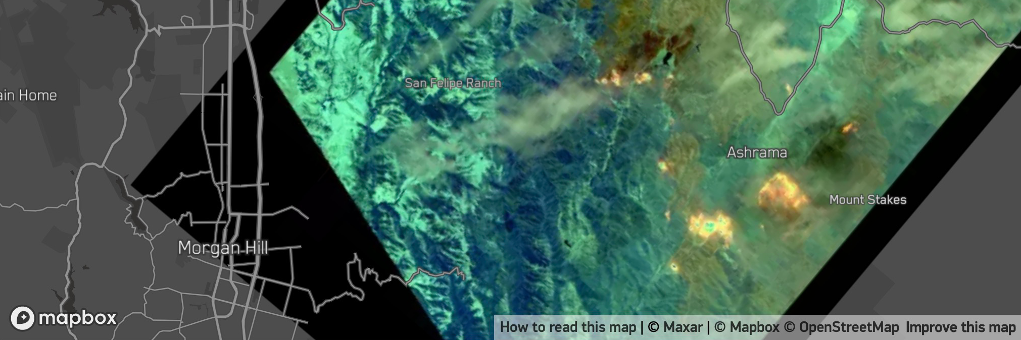
raster
A raster style layer renders raster tiles on a map. You can use a raster layer to configure the color parameters of raster tiles.
raster-brightness-max
Paint property. Optional number. Defaults to 1. Supports interpolate expressions. Transitionable.
Increase or reduce the brightness of the image. The value is the maximum brightness.
raster-brightness-min
Paint property. Optional number. Defaults to 0. Supports interpolate expressions. Transitionable.
Increase or reduce the brightness of the image. The value is the minimum brightness.
raster-contrast
Paint property. Optional number. Defaults to 0. Supports interpolate expressions. Transitionable.
Increase or reduce the contrast of the image.
raster-fade-duration
Paint property. Optional number. Units in millisecondsUnits in Defaults to 300. Supports interpolate expressions.
Fade duration when a new tile is added.
raster-hue-rotate
Paint property. Optional number. Units in degreesUnits in Defaults to 0. Supports interpolate expressions. Transitionable.
Rotates hues around the color wheel.
raster-opacity
Paint property. Optional number. Defaults to 1. Supports interpolate expressions. Transitionable.
The opacity at which the image will be drawn.
raster-resampling
Paint property. Optional enum. One of "linear", "nearest". Defaults to "linear".
The resampling/interpolation method to use for overscaling, also known as texture magnification filter
- "linear":
- (Bi)linear filtering interpolates pixel values using the weighted average of the four closest original source pixels creating a smooth but blurry look when overscaled
- "nearest":
- Nearest neighbor filtering interpolates pixel values using the nearest original source pixel creating a sharp but pixelated look when overscaled
raster-saturation
Paint property. Optional number. Defaults to 0. Supports interpolate expressions. Transitionable.
Increase or reduce the saturation of the image.
visibility
Layout property. Optional enum. One of "visible", "none". Defaults to "visible".
Whether this layer is displayed.
- "visible":
- The layer is shown.
- "none":
- The layer is not shown.
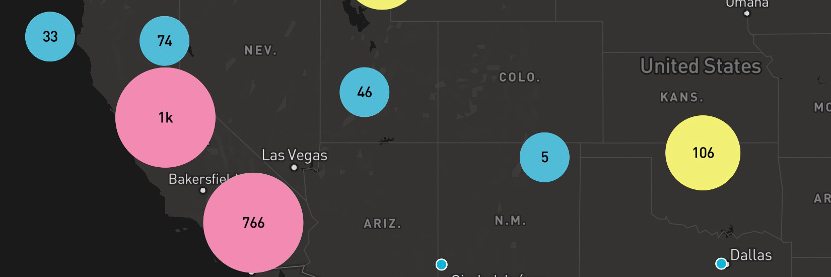
circle
A circle style layer renders one or more filled circles on a map. You can use a circle layer to configure the visual appearance of point or point collection features in vector tiles. A circle layer renders circles whose radii are measured in screen units.
circle-blur
Paint property. Optional number. Defaults to 0. Supports feature-state and interpolate expressions. Transitionable.
Amount to blur the circle. 1 blurs the circle such that only the centerpoint is full opacity.
circle-color
Paint property. Optional color. Defaults to "#000000". Supports feature-state and interpolate expressions. Transitionable.
The fill color of the circle.
circle-opacity
Paint property. Optional number. Defaults to 1. Supports feature-state and interpolate expressions. Transitionable.
The opacity at which the circle will be drawn.
circle-pitch-alignment
Paint property. Optional enum. One of "map", "viewport". Defaults to "viewport".
Orientation of circle when map is pitched.
- "map":
- The circle is aligned to the plane of the map.
- "viewport":
- The circle is aligned to the plane of the viewport.
circle-pitch-scale
Paint property. Optional enum. One of "map", "viewport". Defaults to "map".
Controls the scaling behavior of the circle when the map is pitched.
- "map":
- Circles are scaled according to their apparent distance to the camera.
- "viewport":
- Circles are not scaled.
circle-radius
Paint property. Optional number. Units in pixelsUnits in Defaults to 5. Supports feature-state and interpolate expressions. Transitionable.
Circle radius.
circle-sort-key
Layout property. Optional number.
Sorts features in ascending order based on this value. Features with a higher sort key will appear above features with a lower sort key.
circle-stroke-color
Paint property. Optional color. Defaults to "#000000". Supports feature-state and interpolate expressions. Transitionable.
The stroke color of the circle.
circle-stroke-opacity
Paint property. Optional number. Defaults to 1. Supports feature-state and interpolate expressions. Transitionable.
The opacity of the circle's stroke.
circle-stroke-width
Paint property. Optional number. Units in pixelsUnits in Defaults to 0. Supports feature-state and interpolate expressions. Transitionable.
The width of the circle's stroke. Strokes are placed outside of the circle-radius.
circle-translate
Paint property. Optional array of numbers. Units in pixelsUnits in Defaults to [0,0]. Supports interpolate expressions. Transitionable.
The geometry's offset. Values are [x, y] where negatives indicate left and up, respectively.
circle-translate-anchor
Paint property. Optional enum. One of "map", "viewport". Defaults to "map". Requires circle-translate.
Controls the frame of reference for circle-translate.
- "map":
- The circle is translated relative to the map.
- "viewport":
- The circle is translated relative to the viewport.
visibility
Layout property. Optional enum. One of "visible", "none". Defaults to "visible".
Whether this layer is displayed.
- "visible":
- The layer is shown.
- "none":
- The layer is not shown.
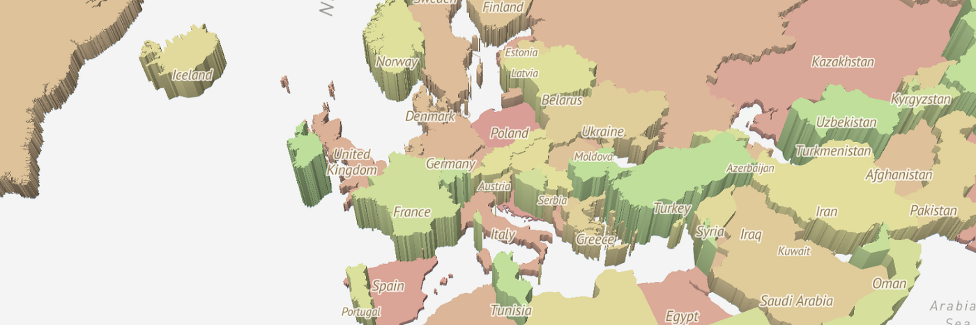
fill-extrusion
A fill-extrusion style layer renders one or more filled (and optionally stroked) extruded (3D) polygons on a map. You can use a fill-extrusion layer to configure the extrusion and visual appearance of polygon or multipolygon features.
fill-extrusion-base
Paint property. Optional number. Units in metersUnits in Defaults to 0. Requires fill-extrusion-height. Supports feature-state and interpolate expressions. Transitionable.
The height with which to extrude the base of this layer. Must be less than or equal to fill-extrusion-height.
fill-extrusion-color
Paint property. Optional color. Defaults to "#000000". Disabled by fill-extrusion-pattern. Supports feature-state and interpolate expressions. Transitionable.
The base color of the extruded fill. The extrusion's surfaces will be shaded differently based on this color in combination with the root light settings. If this color is specified as rgba with an alpha component, the alpha component will be ignored; use fill-extrusion-opacity to set layer opacity.
fill-extrusion-height
Paint property. Optional number. Units in metersUnits in Defaults to 0. Supports feature-state and interpolate expressions. Transitionable.
The height with which to extrude this layer.
fill-extrusion-opacity
Paint property. Optional number. Defaults to 1. Supports interpolate expressions. Transitionable.
The opacity of the entire fill extrusion layer. This is rendered on a per-layer, not per-feature, basis, and data-driven styling is not available.
fill-extrusion-pattern
Paint property. Optional resolvedImage. Transitionable.
Name of image in sprite to use for drawing images on extruded fills. For seamless patterns, image width and height must be a factor of two (2, 4, 8, ..., 512). Note that zoom-dependent expressions will be evaluated only at integer zoom levels.
fill-extrusion-translate
Paint property. Optional array of numbers. Units in pixelsUnits in Defaults to [0,0]. Supports interpolate expressions. Transitionable.
The geometry's offset. Values are [x, y] where negatives indicate left and up (on the flat plane), respectively.
fill-extrusion-translate-anchor
Paint property. Optional enum. One of "map", "viewport". Defaults to "map". Requires fill-extrusion-translate.
Controls the frame of reference for fill-extrusion-translate.
- "map":
- The fill extrusion is translated relative to the map.
- "viewport":
- The fill extrusion is translated relative to the viewport.
fill-extrusion-vertical-gradient
Paint property. Optional boolean. Defaults to true.
Whether to apply a vertical gradient to the sides of a fill-extrusion layer. If true, sides will be shaded slightly darker farther down.
visibility
Layout property. Optional enum. One of "visible", "none". Defaults to "visible".
Whether this layer is displayed.
- "visible":
- The layer is shown.
- "none":
- The layer is not shown.
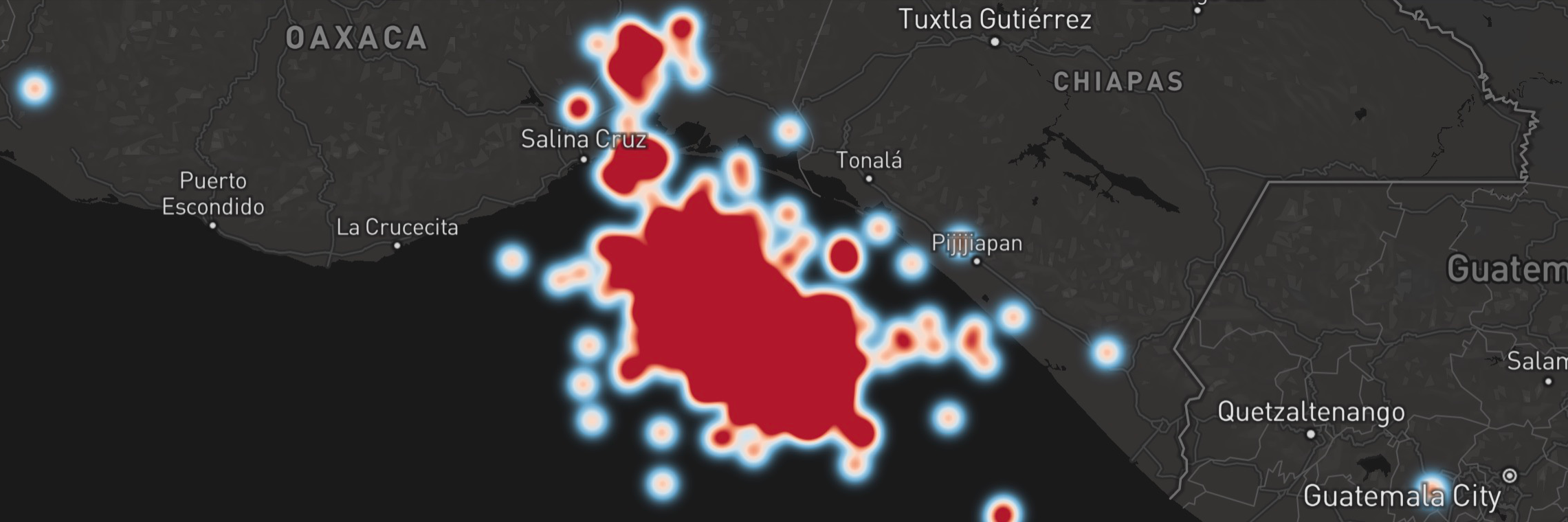
heatmap
A heatmap style layer renders a range of colors to represent the density of points in an area.
heatmap-color
Paint property. Optional color. Defaults to ["interpolate",["linear"],["heatmap-density"],0,"rgba(0, 0, 255, 0)",0.1,"royalblue",0.3,"cyan",0.5,"lime",0.7,"yellow",1,"red"]. Supports interpolate expressions.
Defines the color of each pixel based on its density value in a heatmap. Should be an expression that uses ["heatmap-density"] as input.
heatmap-intensity
Paint property. Optional number. Defaults to 1. Supports interpolate expressions. Transitionable.
Similar to heatmap-weight but controls the intensity of the heatmap globally. Primarily used for adjusting the heatmap based on zoom level.
heatmap-opacity
Paint property. Optional number. Defaults to 1. Supports interpolate expressions. Transitionable.
The global opacity at which the heatmap layer will be drawn.
heatmap-radius
Paint property. Optional number. Units in pixelsUnits in Defaults to 30. Supports feature-state and interpolate expressions. Transitionable.
Radius of influence of one heatmap point in pixels. Increasing the value makes the heatmap smoother, but less detailed.
heatmap-weight
Paint property. Optional number. Defaults to 1. Supports feature-state and interpolate expressions.
A measure of how much an individual point contributes to the heatmap. A value of 10 would be equivalent to having 10 points of weight 1 in the same spot. Especially useful when combined with clustering.
visibility
Layout property. Optional enum. One of "visible", "none". Defaults to "visible".
Whether this layer is displayed.
- "visible":
- The layer is shown.
- "none":
- The layer is not shown.
hillshade
A hillshade style layer renders digital elevation model (DEM) data on the client-side. The implementation only supports Mapbox Terrain RGB and Mapzen Terrarium tiles.
hillshade-accent-color
Paint property. Optional color. Defaults to "#000000". Supports interpolate expressions. Transitionable.
The shading color used to accentuate rugged terrain like sharp cliffs and gorges.
hillshade-exaggeration
Paint property. Optional number. Defaults to 0.5. Supports interpolate expressions. Transitionable.
Intensity of the hillshade
hillshade-highlight-color
Paint property. Optional color. Defaults to "#FFFFFF". Supports interpolate expressions. Transitionable.
The shading color of areas that faces towards the light source.
hillshade-illumination-anchor
Paint property. Optional enum. One of "map", "viewport". Defaults to "viewport".
Direction of light source when map is rotated.
- "map":
- The hillshade illumination is relative to the north direction.
- "viewport":
- The hillshade illumination is relative to the top of the viewport.
hillshade-illumination-direction
Paint property. Optional number. Defaults to 335. Supports interpolate expressions.
The direction of the light source used to generate the hillshading with 0 as the top of the viewport if hillshade-illumination-anchor is set to viewport and due north if hillshade-illumination-anchor is set to map.
hillshade-shadow-color
Paint property. Optional color. Defaults to "#000000". Supports interpolate expressions. Transitionable.
The shading color of areas that face away from the light source.
visibility
Layout property. Optional enum. One of "visible", "none". Defaults to "visible".
Whether this layer is displayed.
- "visible":
- The layer is shown.
- "none":
- The layer is not shown.